


The images above are taken from two different light sources to show you how subtle the mica is. At times it glimmers, and at times and certain light, It disappears. The full process video is HERE. My subscribers on YouTube requested the long version. SO, be prepared to fast forward or click and drag the play button to skip through the parts that you might not want to watch. You can always come back!
In this project, I am exploring a new (to me) product by ColourArte. Twinkling H20’s are manufactured in the US, and are highly concentrated pots of watercolor that contain mica. You can read about the manufacturing process HERE. It is a fascinating description about their green manufacturing process. Visit their blog HERE.

Supplies:
Twinkling H20's, Assorted colors (I specify these in the video)
Primary Elements, Assorted colorsl
Chinese White Gouache
White acrylic paint
Winsor Newton Gum Arabic (optional as binder for powders)
12" x 9" Arches 140# cold press paper block
Watercolor brushes, 1/2" (4) Cat Tongue Isabey 6235 Petit Gris
assorted smaller watercolor brushes,
old bristle brush for dry brush technique
Pencil, kneaded eraser
Planning the composition:
Find a source photo (be sure it is copyright free, or use your own). I like to work directly from a digital screen, an iPad or computer. The image is brighter and the shadows do not close up to black as they are prone to do with a print.
I typically like the light source coming from the upper left, with the bulk of the design on the right hand side. Using a composition 'guide' of thirds (think tic-tac-toe), I approximate where the center of interest will fall on one of the intersections. Of course, all bets are off in the middle of a painting. Sometimes this area will change as you work so just let the muse take over and go with it!
There is an attempt to have a somewhat circular design that will keep a viewer's eye floating around the painting, each supporting the other and leading to the other. Make sure you don't have any edge of your design touching the edge (kissing). Either give it some air, or make it go off the edge. Think in contrasts, light/dark, soft/hard edges, texture/smooth, high chroma/low chroma..
Prepare the Twinkling H20s and the design:
It is recommended to use clear water and drop 3-4 drops into the pot, more or less, depending on how much reconstituted watercolor you think you'll need. Store these with the lids off! The water will evaporate, and be back to its hardened state ready for another project.
Using the pencil, LIGHTLY sketch the major areas of your design onto the paper. Use a kneaded eraser sparingly for edits…pencil marks show the hand of the artist!
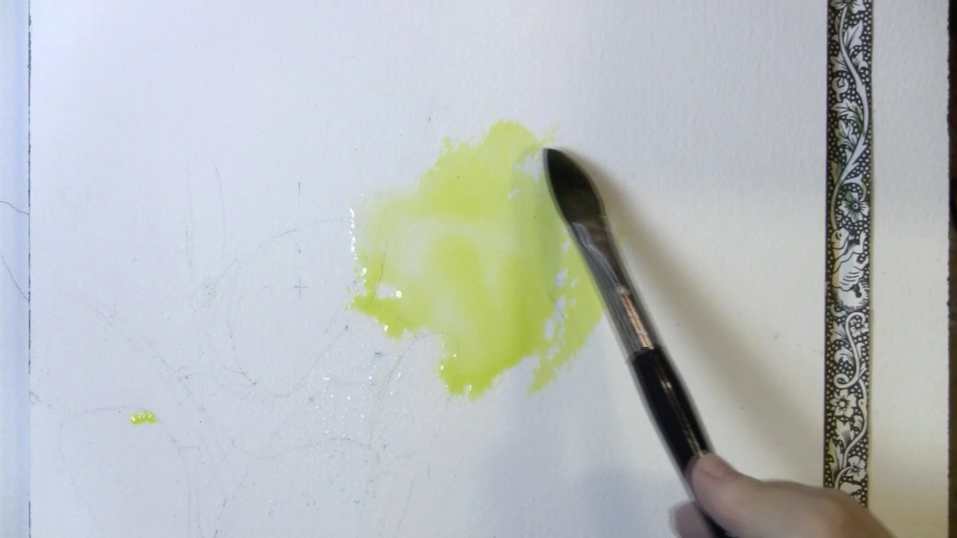
With a yellow, put a small amount into a palette well. I use whatever is handy, but for this I used a porcelain palette purchased for a few dollars from Hobby Lobby. Add a generous amount of water to the drop of yellow. You will see in the video that I didn't water down the pigment enough. These also behave as dye paints, and are not liftable. They stain. I didn't take this into account, and struggled with the intense color. Do as I say, not as I do!
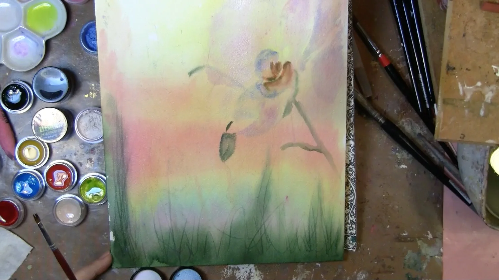
Paint the Background:
Completely wet the paper, and with a large watercolor brush, apply a halo of yellow to the paper, making sure to work the yellow out into the paper. NO HARD EDGES. Be gentle with the paper. You can even use a sponge to wet the paper.
While the paper is still wet, paint an area about 1/3 down using a light orange or coral. Under this do another section of a darker warm color like red. As you move down the page, add orchid, blue, and into green. At the bottom edge, place a section of a dark green. Make sure all the areas blend into each other.
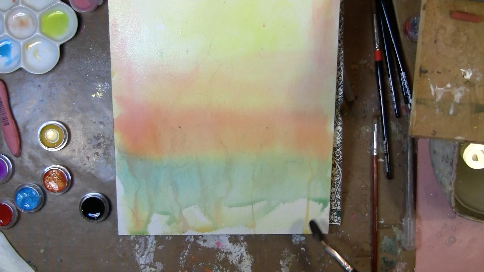
With the end of your paint brush, score the paper in the bottom areas. The pigment will settle in these scars and create the illusion of grasses and twigs. This process creates texture, visual and tactile.
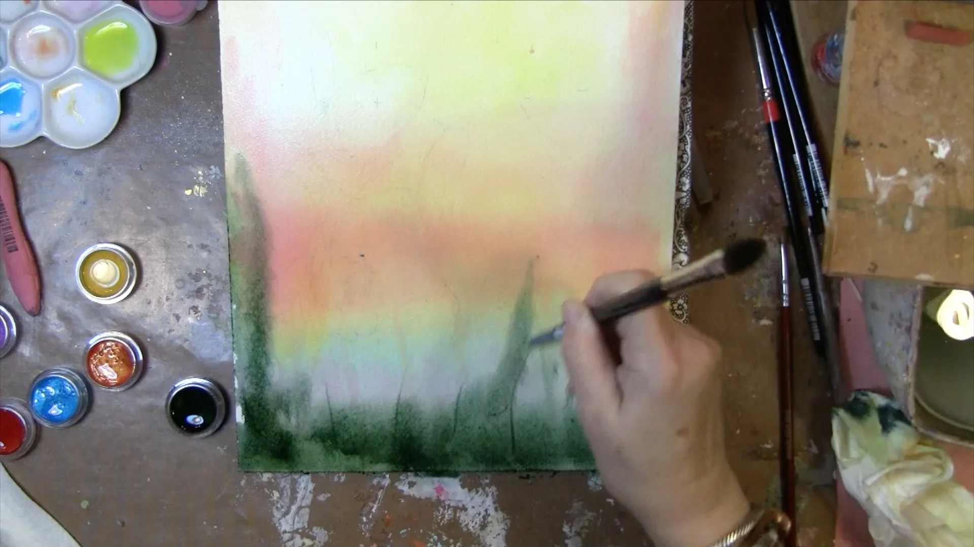
Let the paper dry, or use a hair dryer or heat gun.
Begin the Orchids:
With a very watery mixture on wet paper, I begin adding pinks and light blues and orchids. Try to leave spots of bare paper where your lightest lights are to be. As you will see, I forgot to leave whites, but since my yellow was so strong, it wouldn't have helped. I used Chinese White Gouache and ultimately some acrylic white to pull the lights back.
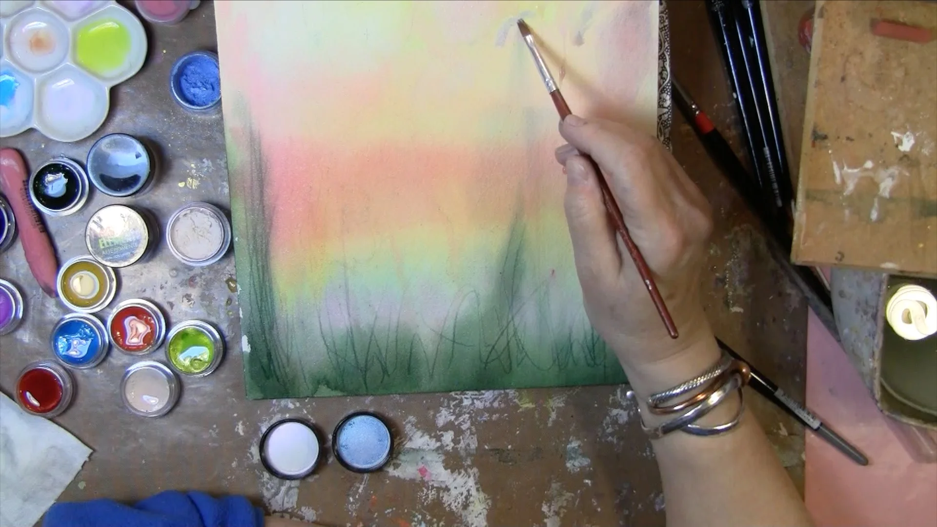
Take your time. Spend more time observing your image. Occasionally, let the paper dry so the underlayers are less prone to move with new layers.
Leave your darkest darks for some of the final steps. If you keep it light as long as you can, the shapes can be modified more easily. All your edges should be soft and fuzzy until the very last.
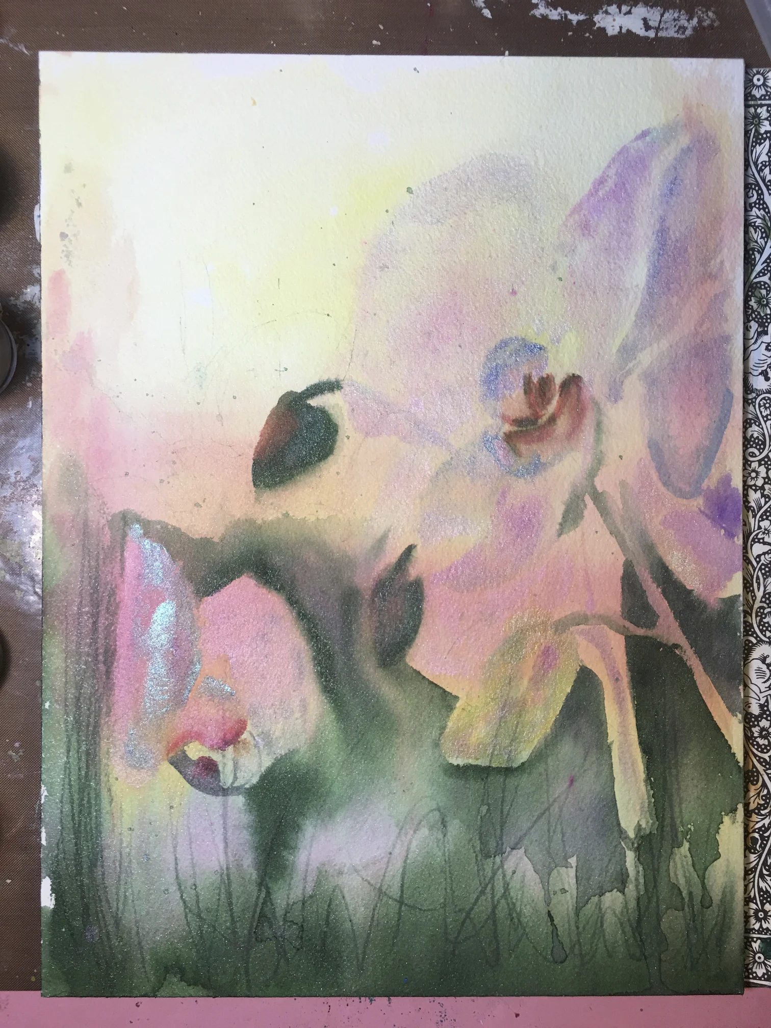
There is a bonus section in the video where I film some options in Photoshop. This helps me decide where I want to take the painting from this point.
When you are satisfied with your rendering, making sure your painting matches the original image to your satisfaction, enhance the darks and add detail in your focal areas. Remember where the light source is, and emphasize the darks on the right hand edge of the shapes.
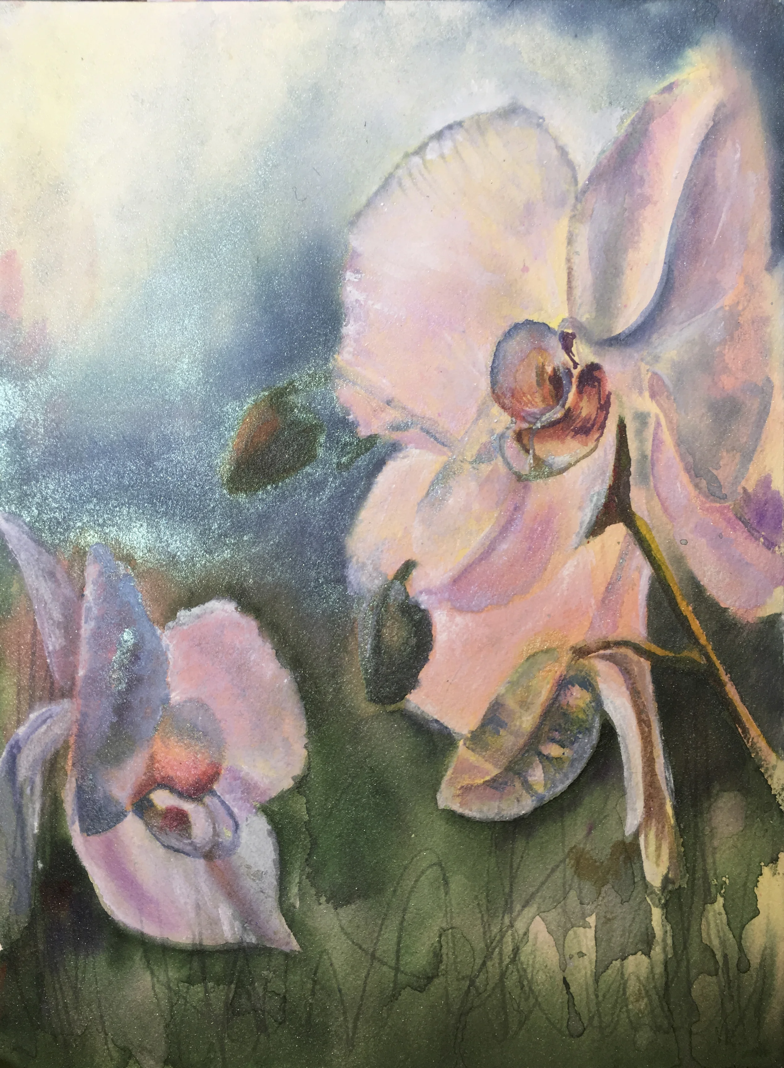
The Chinese White Gouache can be very slightly tinted with your light colors. It is translucent with water and will allow the colors to show through. Cover a general area larger than your highlights will eventually be. Let each layer dry between layers. Gradually repeat this process in gradually decreasing area with each layer.
At the same time, gradually reduce the quantity of water which will help the gouache become more opaque. When your area of focus is reduced in size to just larger than a highlight, take a wee bit of white acrylic on a small wet brush and careully place a few highlight marks in the center of your last layer of gouache.
Congratulations! You have creates a subtle, gradual area of lightness that will serve to give your petals 3-dimensional form.
This project has about twelve hours of work.
xxoo
